

How to Choose the Perfect Color Palette for Your HDB Renovation
Choosing the right color palette is one of the most exciting—and sometimes challenging—parts of any renovation. The colors you select will set the tone for your home, influence its mood, and help create a cohesive look throughout your space. Whether you’re drawn to neutral tones, bold accents, or a blend of the two, picking the perfect color palette for your HDB flat can transform it from ordinary to extraordinary.
In this post, we’ll guide you through the process of choosing a color palette that complements your home’s layout, design style, and personal preferences. From understanding color psychology to practical tips on blending hues, this guide will help you create a space that reflects your personality and feels like home.
1. Start with the Mood You Want to Create
The first step in selecting your color palette is to think about the mood you want to evoke in each room. Different colors can affect how a space feels, so it’s important to choose hues that align with how you want to experience your home.
Color Psychology Basics:
• Cool Colors (Blues, Greens, Purples): These colors tend to create a calm, relaxing atmosphere. Cool tones are ideal for bedrooms, bathrooms, and other spaces where you want to unwind.
• Warm Colors (Reds, Yellows, Oranges): Warm colors are energizing and inviting. They work well in social spaces like the living room or dining area, where you want to foster conversation and warmth.
• Neutral Colors (Beiges, Whites, Greys): Neutrals are versatile and timeless. They create a clean, sophisticated backdrop that can be dressed up or down with accent colors.
Pro-Tip: Consider the function of each room when selecting colors. For example, soft blues or greens are perfect for a restful bedroom, while warm yellows or oranges can make a dining room feel lively and welcoming.
2. Choose a Base Color
Once you’ve decided on the mood you want to create, choose a base color that will serve as the foundation for your palette. This will be the dominant color used on larger surfaces like walls, floors, or cabinets.
Choosing a Base Color:
• Neutral Base: If you want flexibility and a clean look, choose a neutral color like white, beige, or grey. Neutral bases provide a blank canvas that allows you to introduce color through accents and decor.
• Bold Base: For a more dramatic effect, choose a bold color as your base. Darker hues like navy blue, charcoal grey, or forest green can create a striking backdrop for lighter furniture and accessories.
Pro-Tip: If you’re unsure where to start, consider using your home’s architectural features—like large windows or natural lighting—as a guide. Natural light can enhance or soften certain colors, so choose shades that work well with the amount of light your space receives.
3. Add Accent Colors for Depth
After selecting your base color, introduce accent colors to add depth and contrast. These can be used on smaller surfaces like feature walls, furniture, or accessories, creating a more dynamic and layered look.
How to Choose Accent Colors:
• Complementary Colors: Choose colors opposite each other on the color wheel (like blue and orange or purple and yellow). This creates a vibrant, high-contrast look.
• Analogous Colors: For a more harmonious feel, choose colors that sit next to each other on the color wheel (like blue and green or red and orange). This creates a softer, more cohesive effect.
• Monochromatic Scheme: Stick to different shades of the same color for a subtle, elegant look. For example, pair a soft grey with charcoal and white to create a sleek, minimalist space.
Pro-Tip: Keep your accents simple by using them on decor items like throw pillows, rugs, and artwork. This allows you to change the look of the room without having to commit to repainting walls or replacing major furniture pieces.
4. Consider the Size and Layout of the Space
The size and layout of your HDB flat should influence your color choices. Certain colors can make small spaces feel more open, while others can help define zones or create focal points in an open-concept layout.
Color Tips for Small Spaces:
• Light Colors to Open Up the Room: Lighter colors like whites, soft greys, or pastels can make a small room feel larger and more airy by reflecting more light.
• Accent Walls for Depth: Use a darker color on one feature wall to add depth and dimension to small rooms, without overwhelming the space.
• Cohesive Palette for Flow: In small or open-concept flats, stick to a cohesive color palette throughout the space to create flow and avoid a cluttered look.
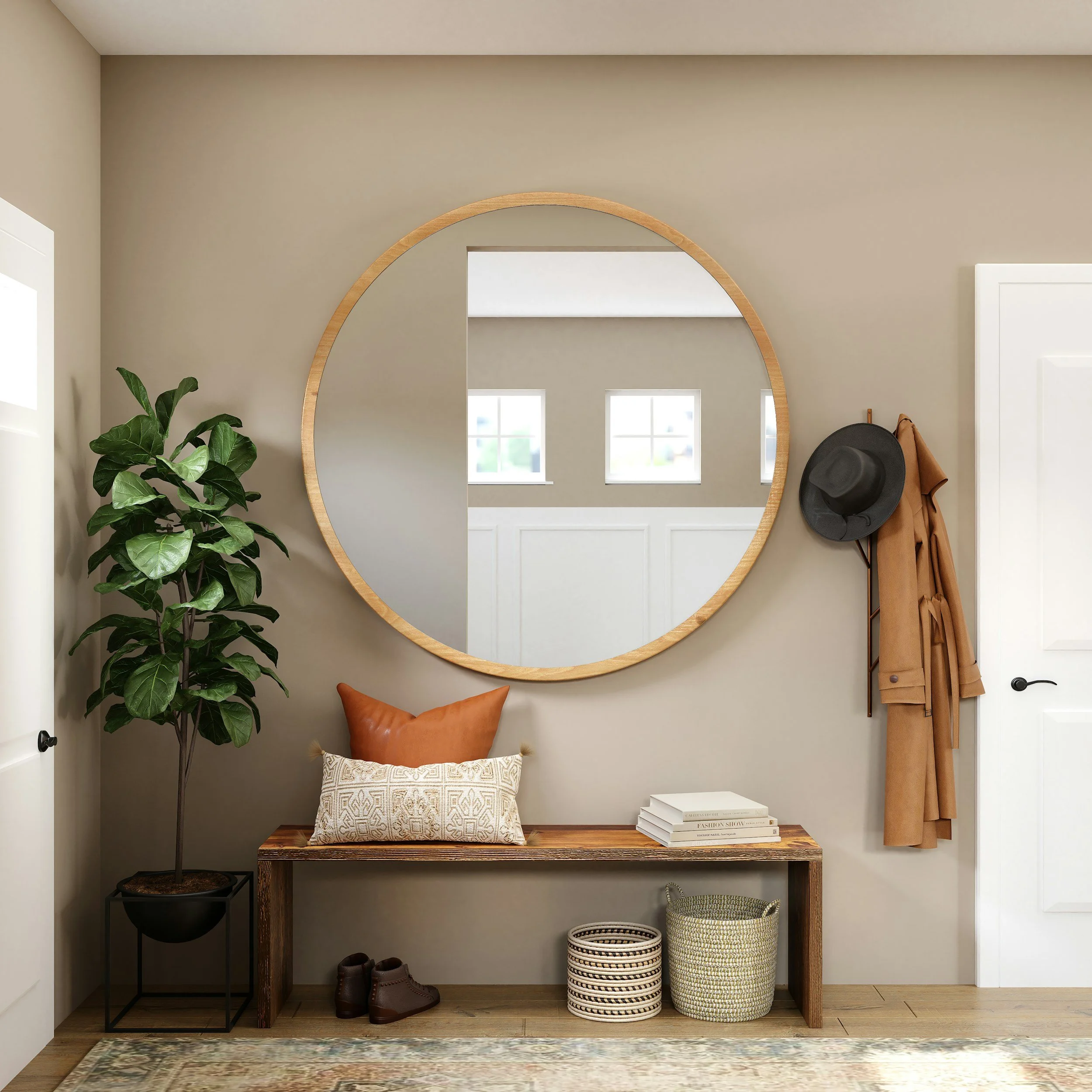
Pro-Tip: Use mirrors to enhance the effect of light colors, helping your small flat feel even more open and spacious.

“Color is a power which directly influences the soul.” — Wassily Kandinsky
5. Balance Bold and Neutral Hues
A well-balanced color palette combines both bold and neutral hues. This balance ensures that your space feels dynamic and interesting, without being overwhelming. In Japandi or minimalist designs, neutral tones tend to dominate, but even these spaces benefit from a pop of color here and there.
Balancing Bold and Neutral Colors:
• The 60-30-10 Rule: A common interior design rule for color balance is the 60-30-10 rule. Use 60% of your room’s main color (typically the base color), 30% of a secondary color (your accent color), and 10% for bold or contrasting colors.
• Pops of Color: In mostly neutral spaces, add pops of color through decor, textiles, or even plants. A bright blue throw or a red vase can elevate a minimalist room without disrupting the overall aesthetic.
Pro-Tip: Stick to a neutral palette for large, permanent surfaces (like walls or cabinets) and save bold colors for easily changeable elements, like accessories and artwork.
6. Test Colors Before You Commit
Before committing to a color, it’s always a good idea to test it in your space. Colors can look very different depending on lighting, room size, and surrounding elements, so testing your chosen shades can prevent costly mistakes.
How to Test Colors:
• Sample Paint Swatches: Paint a small area of the wall with your chosen color and observe how it looks throughout the day in different lighting conditions.
• Moveable Color Samples: Use moveable swatches or sample boards to test colors on different walls and surfaces. This is especially helpful if you’re trying to match your walls to furniture or flooring.
• Test in Natural and Artificial Light: Colors can change dramatically depending on lighting, so make sure to test your color choices in both natural daylight and artificial evening lighting.
Pro-Tip: If you’re painting multiple rooms, test colors in each room to see how they interact with the natural light and existing decor.
7. Harmonize with Furniture and Decor
Your color palette should work in harmony with your furniture and decor. If you already have key furniture pieces, choose a color scheme that complements those items. On the other hand, if you’re starting from scratch, you can build your color palette and then select furniture that fits within it.
How to Harmonize Colors:
• Neutral Furniture: Neutral-colored furniture (like white, grey, or beige) is versatile and works with almost any color palette. This gives you the flexibility to experiment with bolder colors on walls or accessories.
• Bold Furniture: If your furniture makes a statement, such as a brightly colored sofa or patterned chairs, keep the walls and larger surfaces neutral to let those pieces stand out.
• Coordinating Decor: Use decor pieces like cushions, rugs, and curtains to tie your color palette together. These elements help create a cohesive look without overwhelming the space.
Pro-Tip: Use accent furniture like a brightly colored chair or ottoman to bring in a pop of color that can be easily switched out if your tastes change.
Final Thoughts:
Choosing the perfect color palette for your HDB renovation doesn’t have to be daunting. By focusing on the mood you want to create, balancing bold and neutral colors, and considering the size and layout of your space, you can create a harmonious, beautiful home that reflects your personal style.
Whether you’re aiming for a serene, minimalist retreat or a vibrant, energetic space, the right color choices will bring your vision to life. Don’t be afraid to experiment, and most importantly, choose colors that make you feel at home.